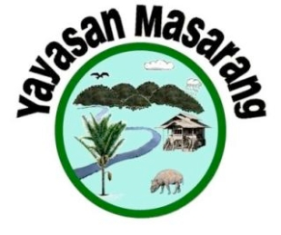
As you probably know Masarang HK Society Limited 青山綠水協會有限公司 was established by a group of dedicated volunteers based in Hong Kong to support the work of Masarang Foundation. What you may not know is the story behind the Masarang Foundation Logo. Below is an explanation by the designer, Dr Willie Smits.

Our logo looks rather unusual and may need some explaining about what philosophy it represents and what I intended to present when I first designed the logo.
First of all about the writing Yayasan Masarang. the word “Yayasan” simply means foundation in Bahasa Indonesia. “Masarang” is a word from the prevalent Tombulu language in North Sulawesi and literally means “like the head of a chicken”. Masarang is the name of a range of extinct volcanoes between the cities of Tomohon and Tondano and, as can be seen with some imagination, in the logo the series of rounded mountain tops resemble the comb on the head of a chicken, hence the name that was given to this range of mountains.
The Masarang mountains have very steep slopes and a hundred years ago all the forest had been converted to coffee plantations, except for a small “hat” on the most left mountain top. The mountain later was used for short term agricultural crops which led to the depletion of the organic matter on the steep slopes and much erosion and surface water run off. The mountain became infamous for its “Masarang water”, named after the 4-5 times a year floods after heavy rain that came down the slopes and gullies towards Tomohon and caused lots of damage and personal losses. Now the mountain has its forest back and with that the floods have gone, the springs are running year round while at the same times more people benefit economically.
The shape of our logo is round with a green ring. This represents the holistic approach of Masarang based upon environmental sustainability, recycling and zero waste systems. The name Yayasan Masarang is circled above all that is in the green ring. Inside the green ring we see depictions of nature on the level of landscape, forest and tree, the latter in the form of the sugar palm. The non natural component representing people is in the form of the traditional house, downhill from the environment supporting nature and along the life bringing water.
The forests produce clouds and rain while harboring biodiversity, represented by birds and the indigenous Babirusa. So what we attempt to show here is the triple P approach of people, planet, profit, and their interdependence. Nature is our home, from which we get food, water, energy and materials for our livelihood. So we need to take care of our home in order to take care of the needs of the next generation. All programs of Masarang are based upon this basic philosophy “Saving nature (and thus people) by empowering local people”.
Willie Smits
Tomohon, North Sulawesi, Indonesia
[…] Masarang.hk had published an extensive explanation of the Masarang Foundation logo by Dr. Willie Smits, founder of the organization in 2001. In summary: […]
By: The Masarang Foundation Logo on February 9, 2013
at 7:57 am